
TAG (Touch A Gleam) Brand Renewal Project
Brand Background
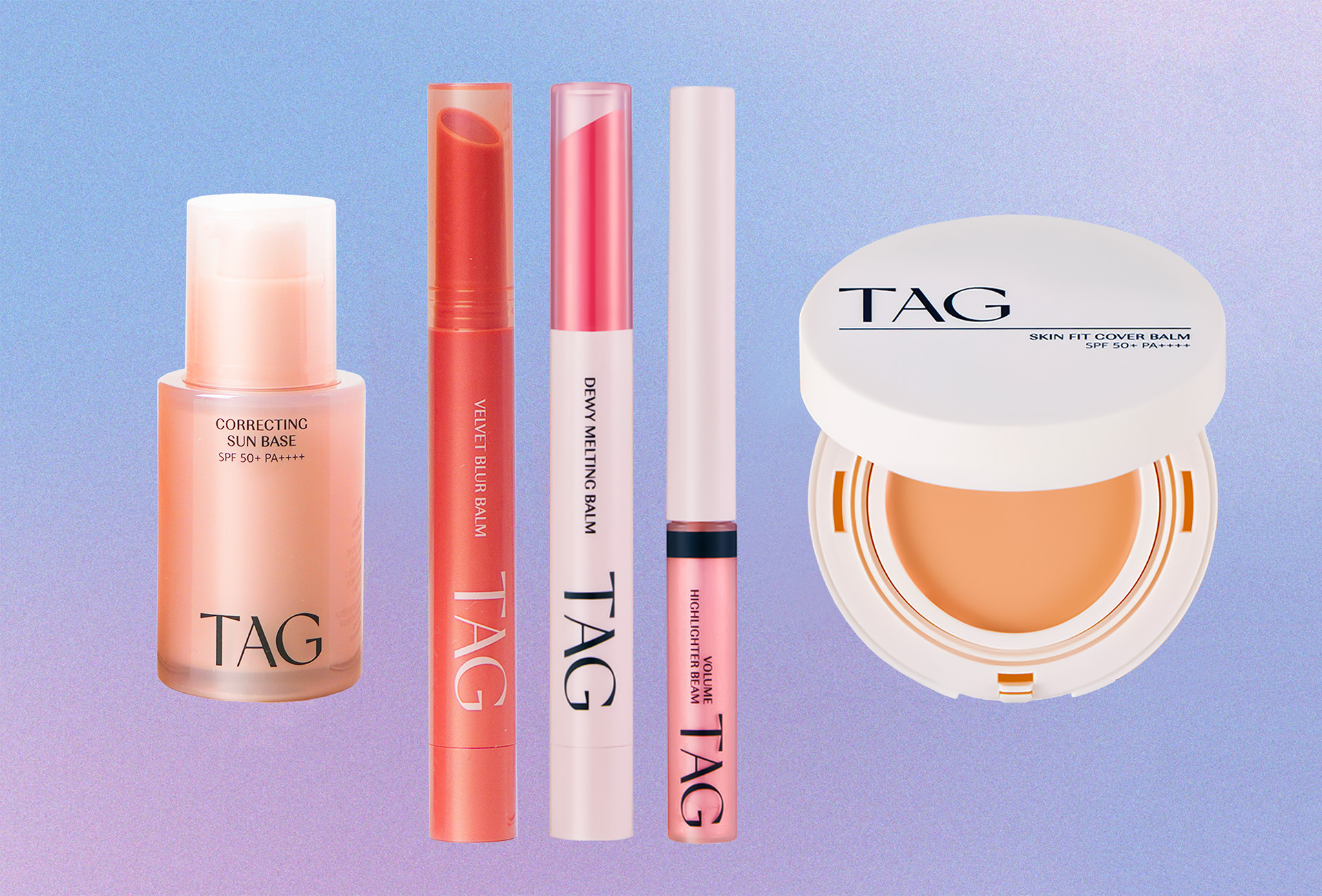
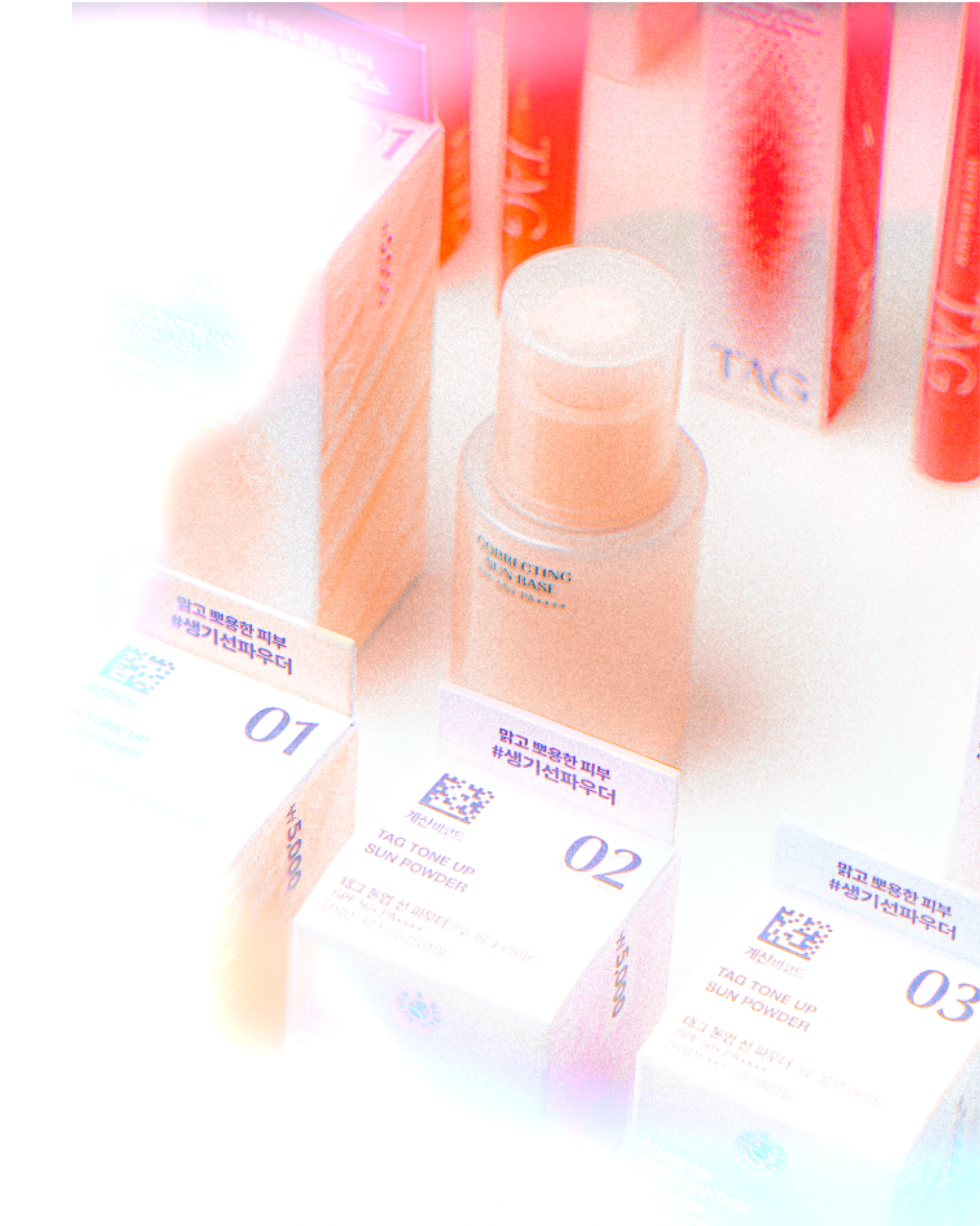
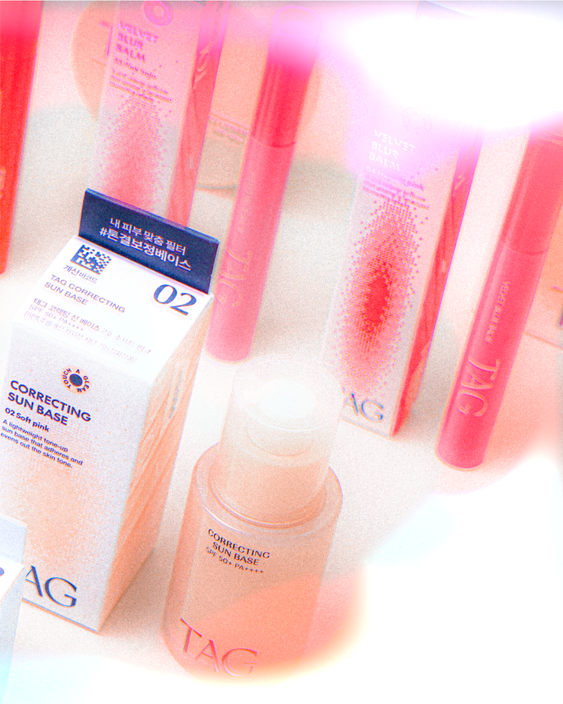
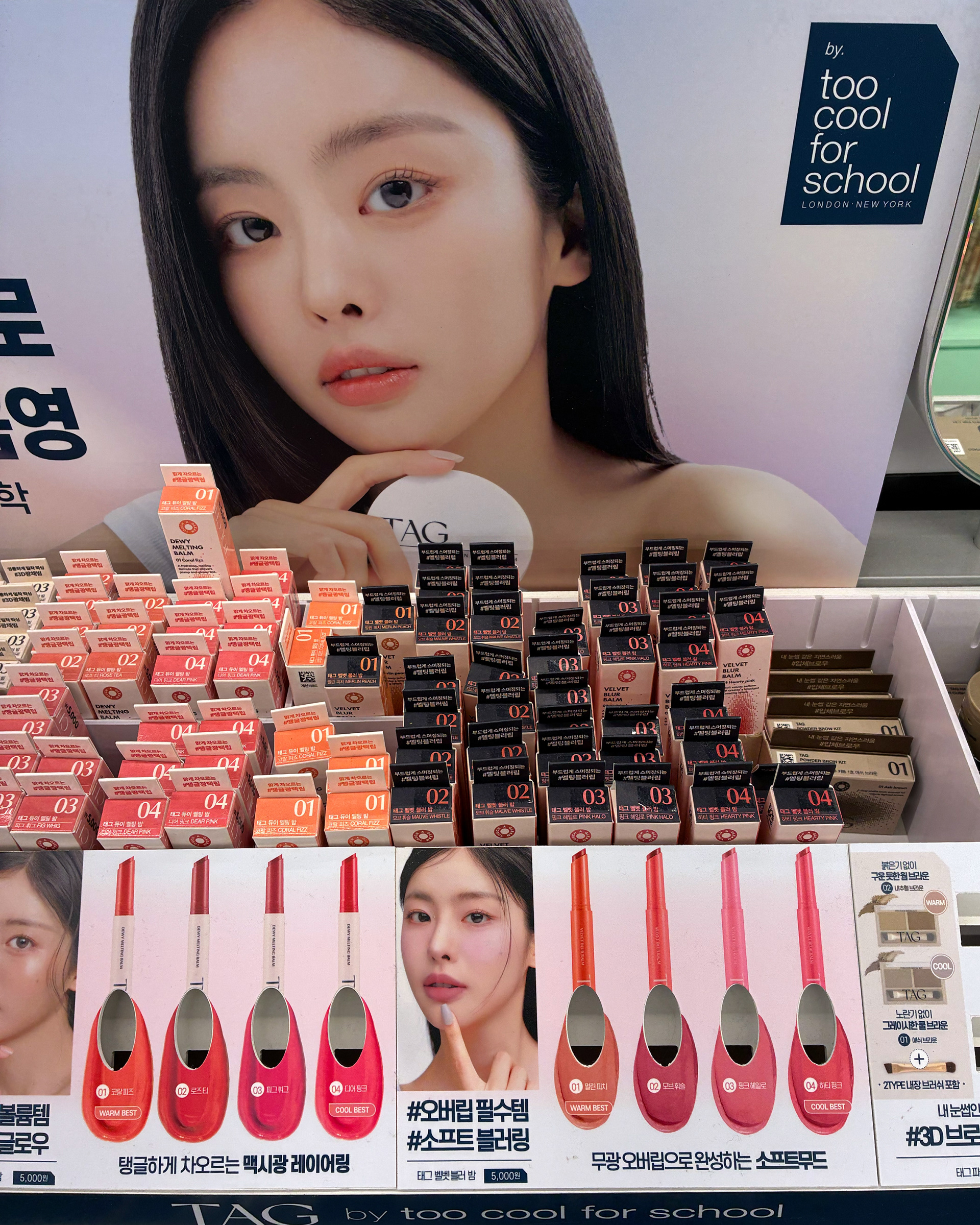
Co-developed by Too Cool for School (@toocoolforschool_official) and Daiso (@daisolife), TAG embraces the tagline “Touch A Gleam”. The brand expresses the harmony of dual beauty through base makeup looks inspired by the interplay of light and shadow.
Project Challenge
As a brand positioned within Daiso’s affordable pricing structure, TAG faced several issues:
• The need for cost-effective design solutions
• Inefficiencies and inconsistencies in its existing graphic and packaging design
• A lack of coherent visual identity and scalability
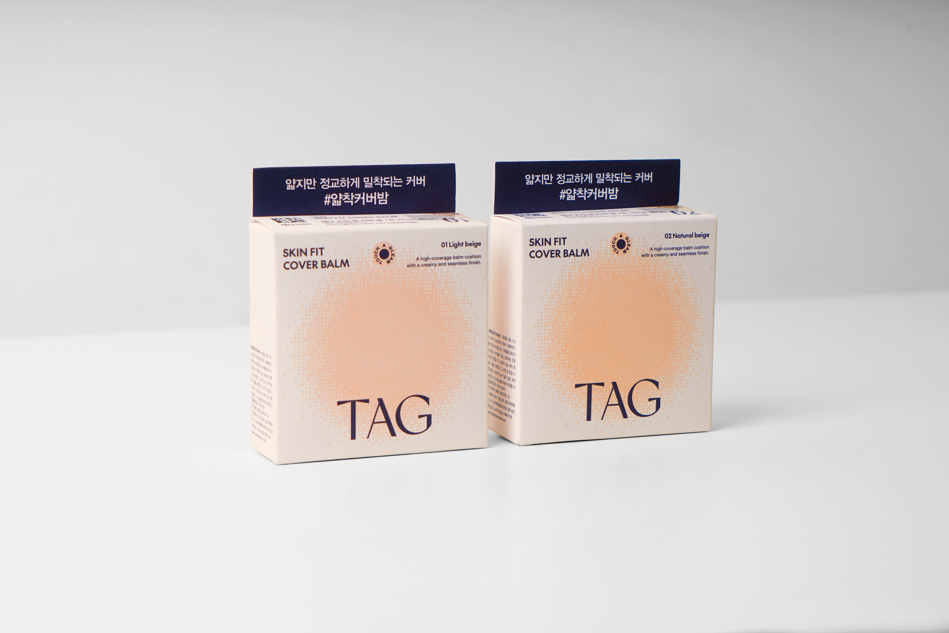
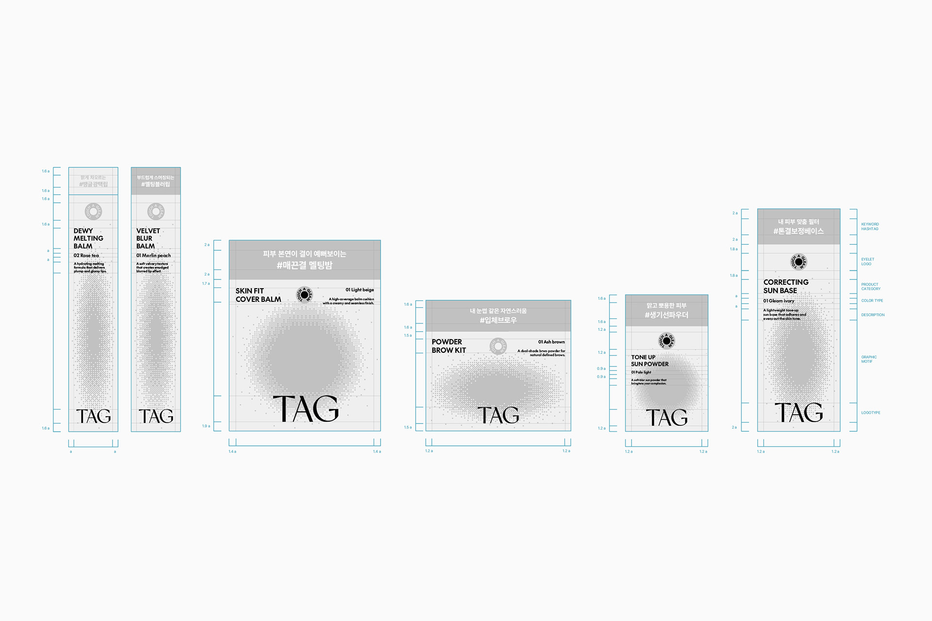
Our role was to redefine the brand identity and build a packaging design system that is both visually consistent and expandable across product families.
Design Approach
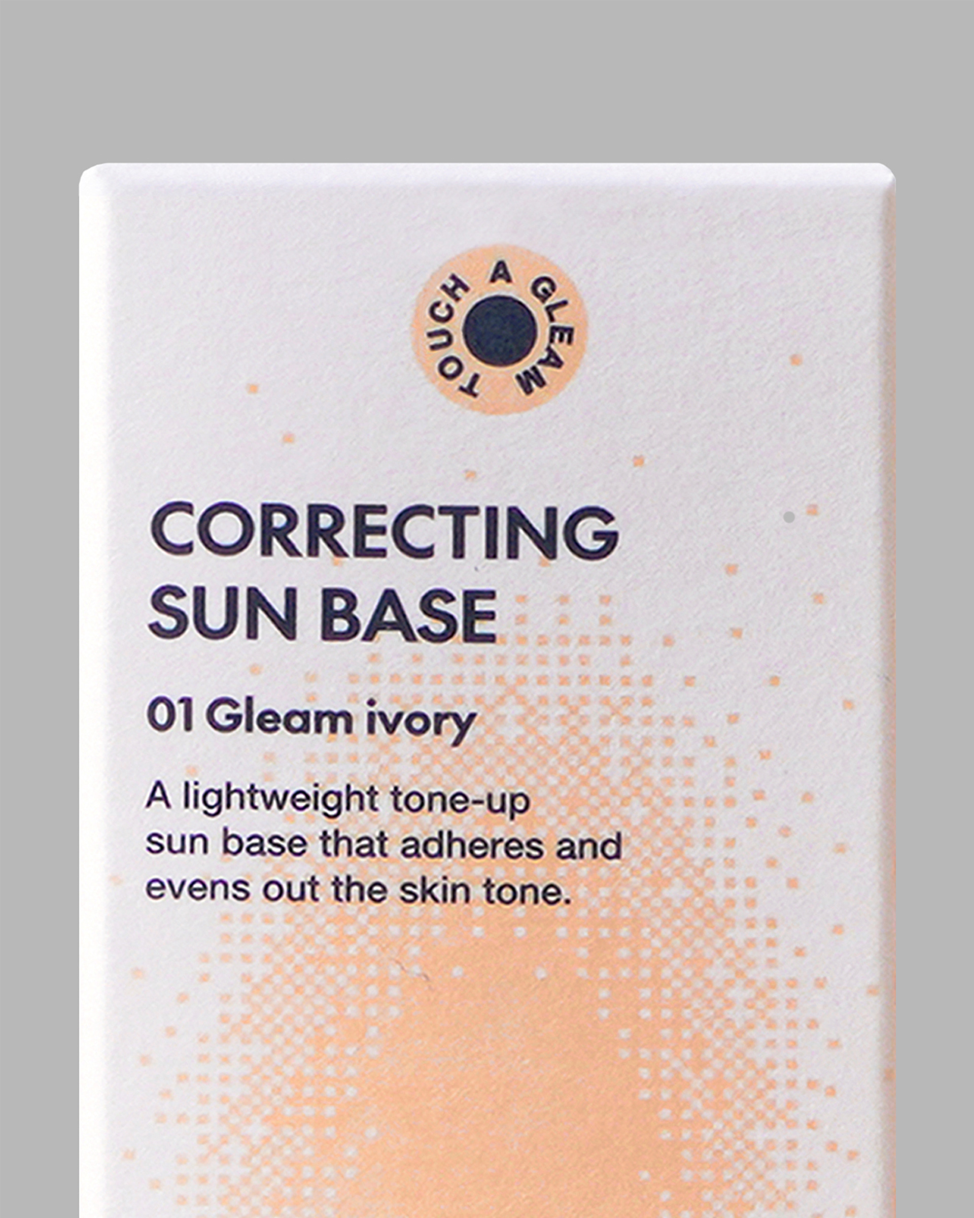
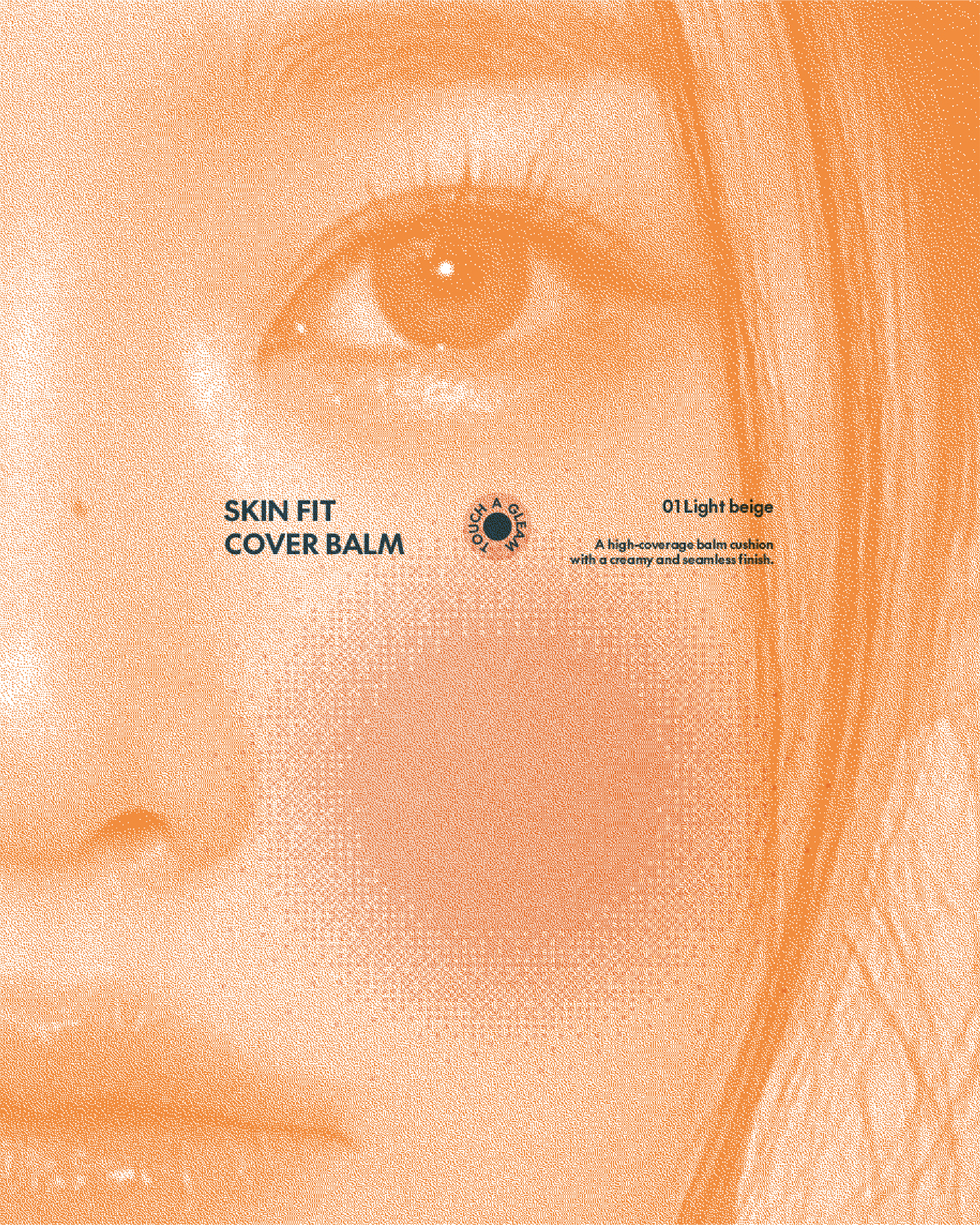
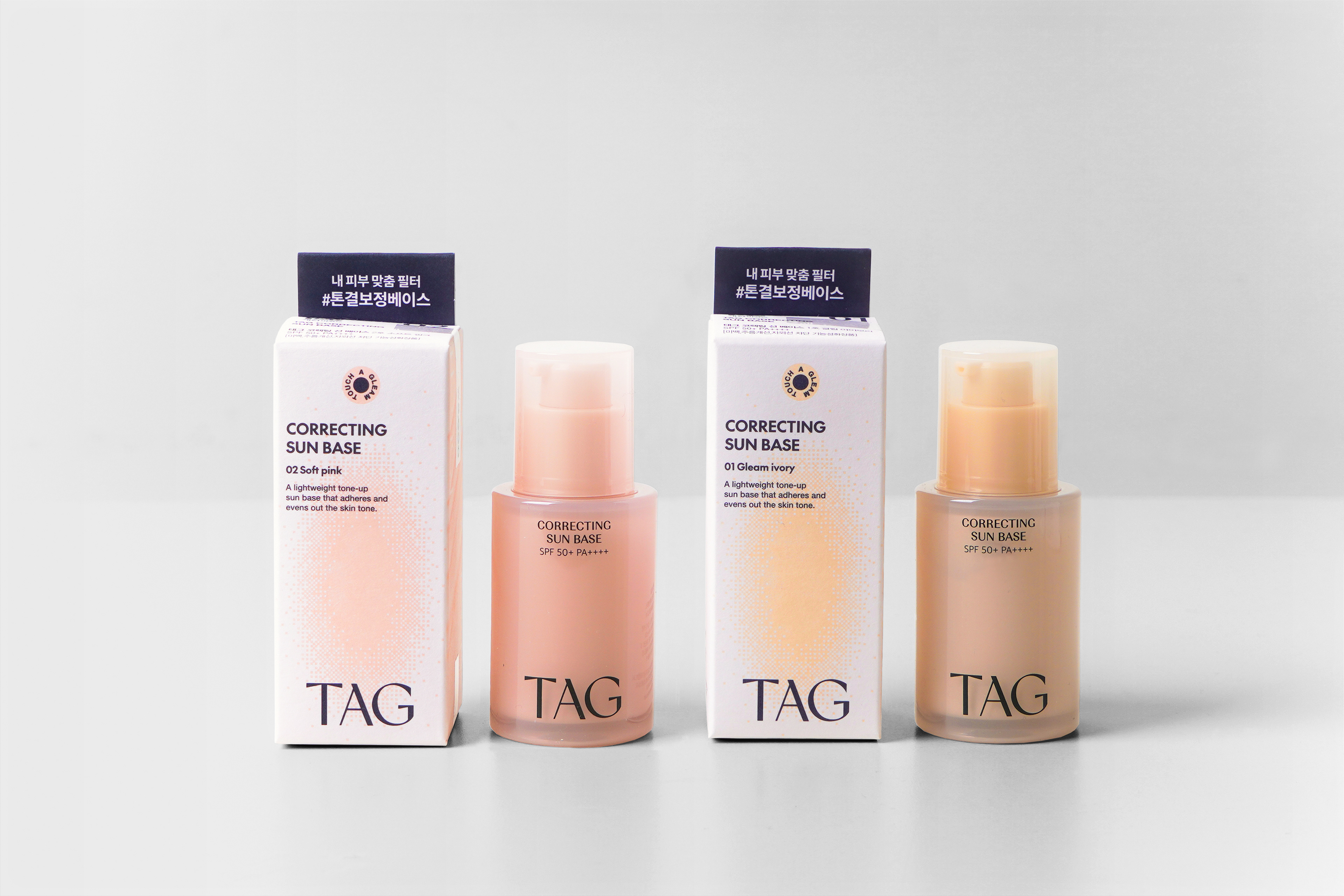
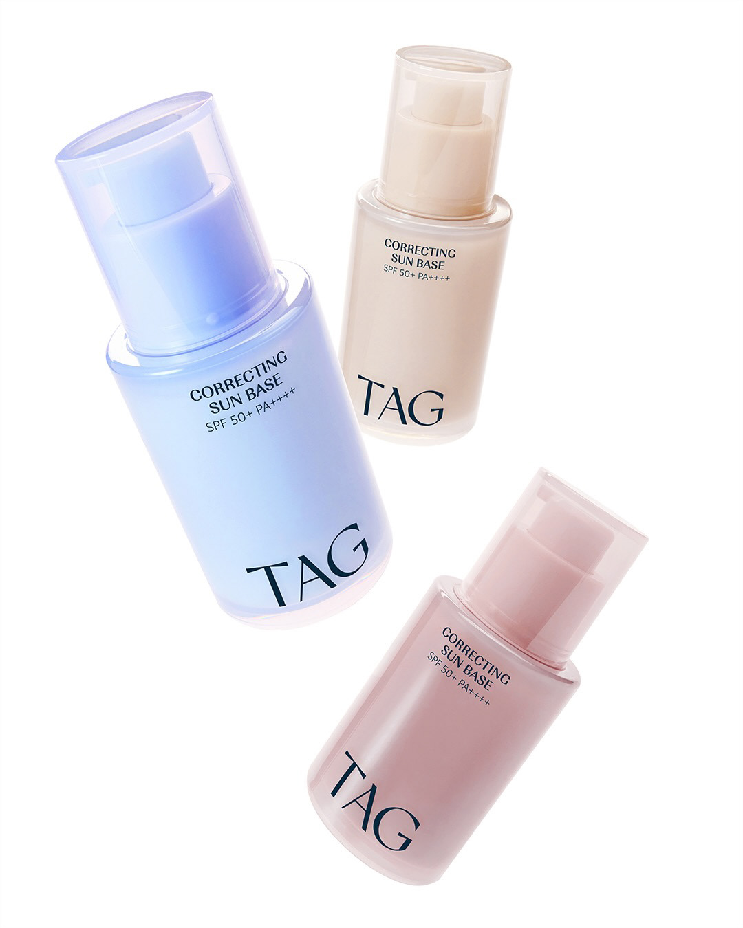
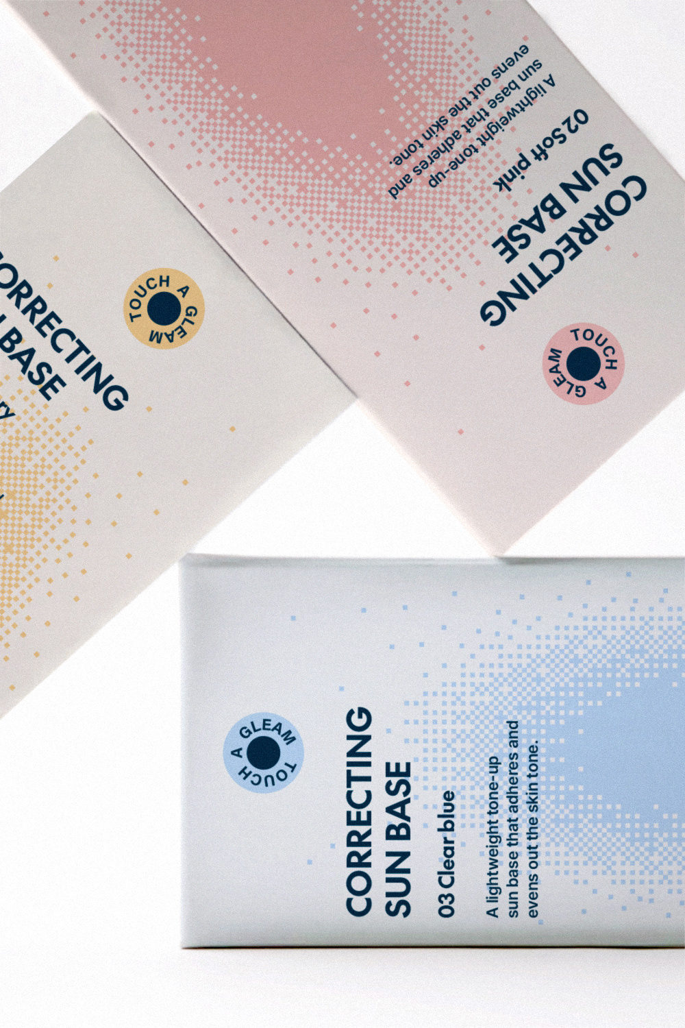
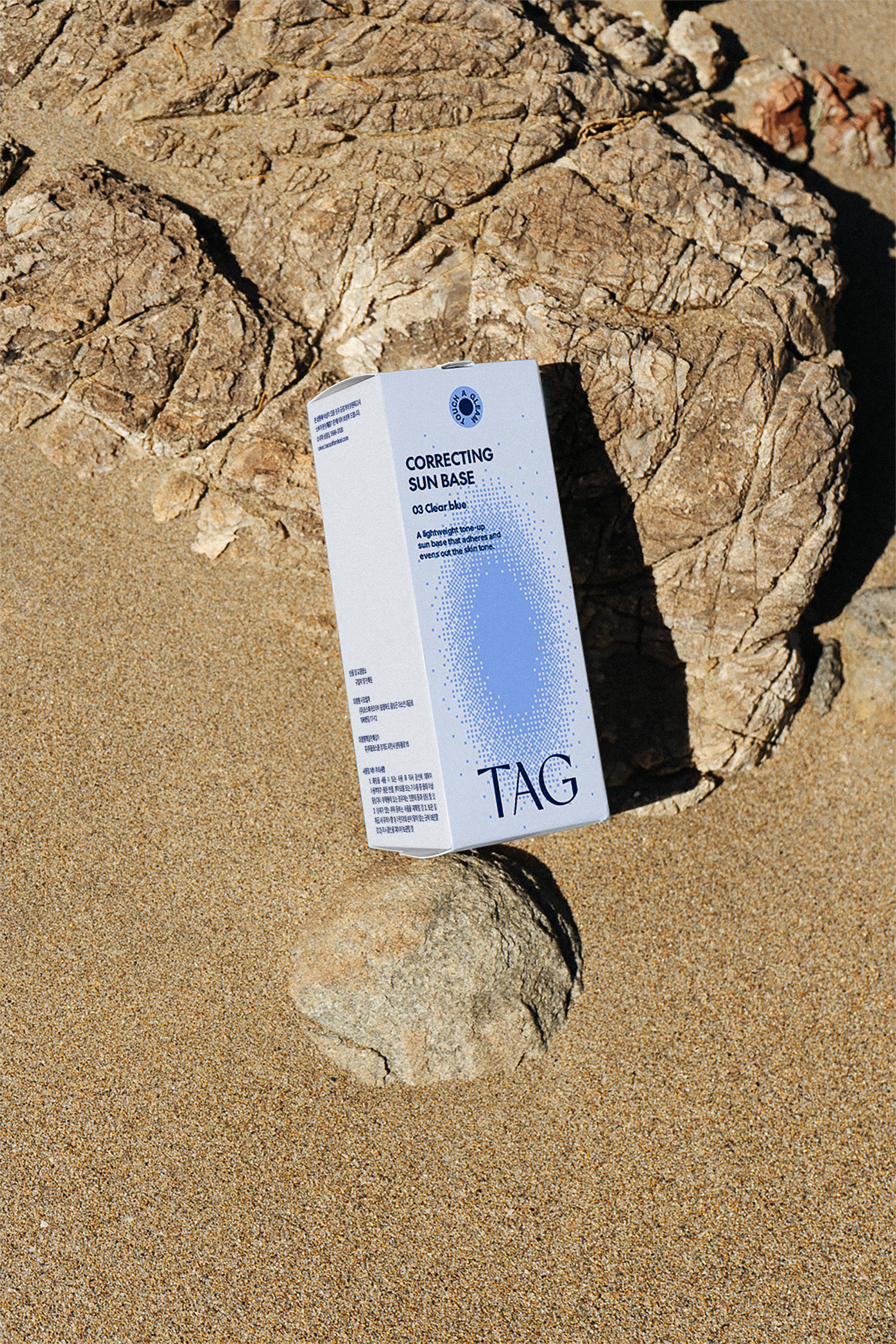
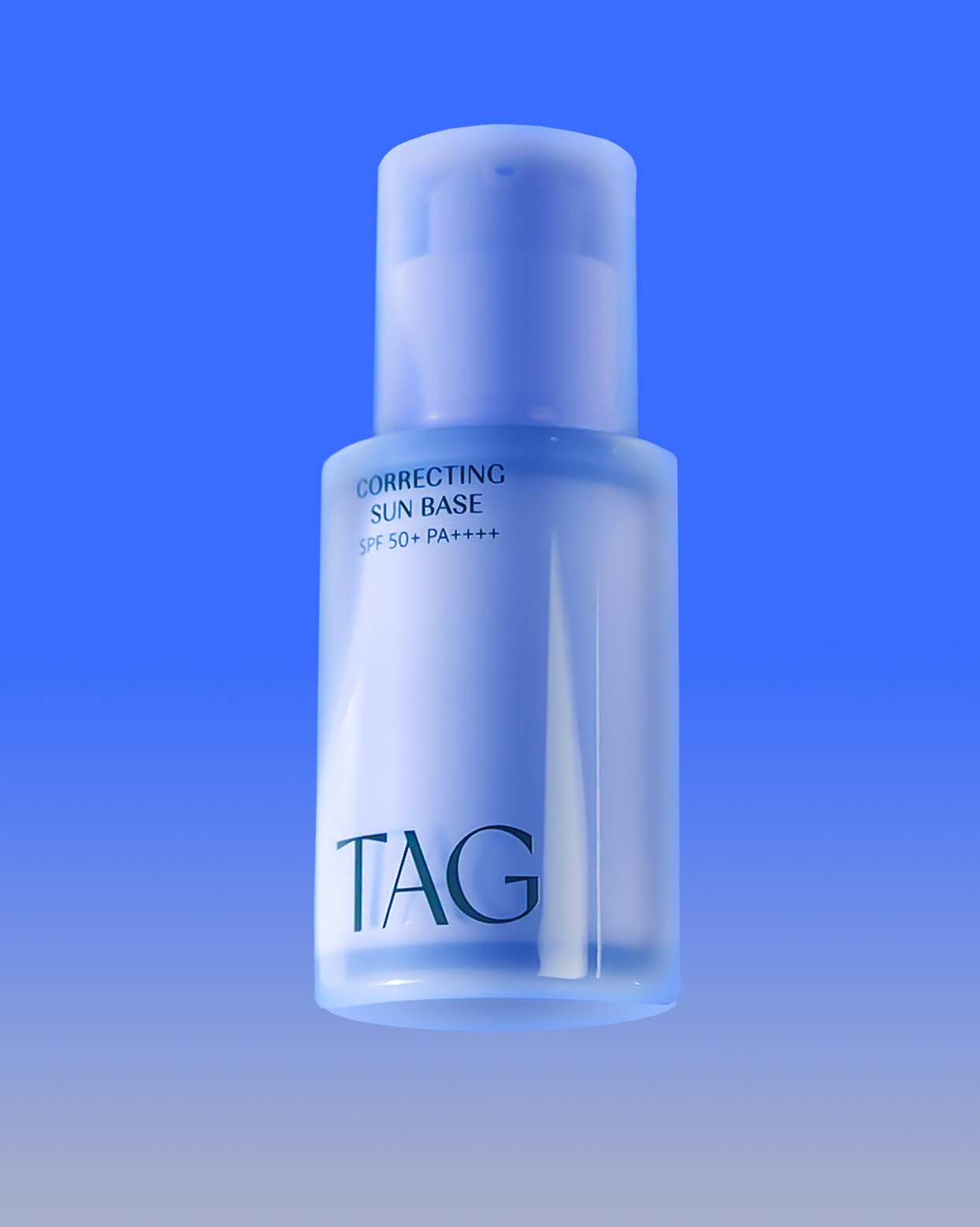
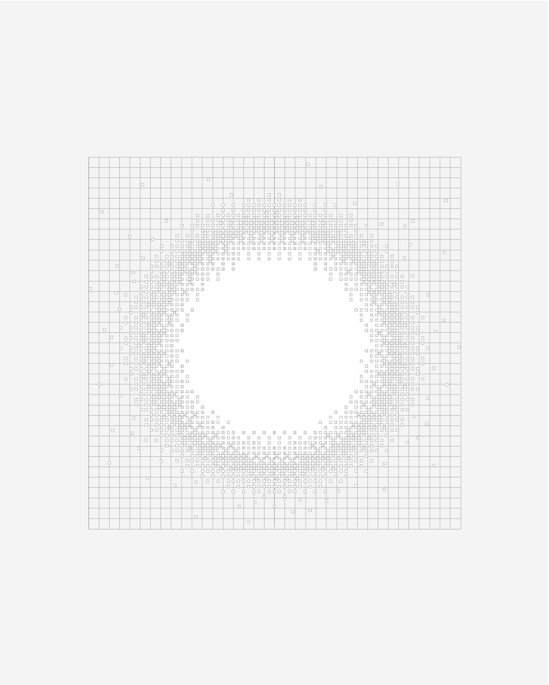
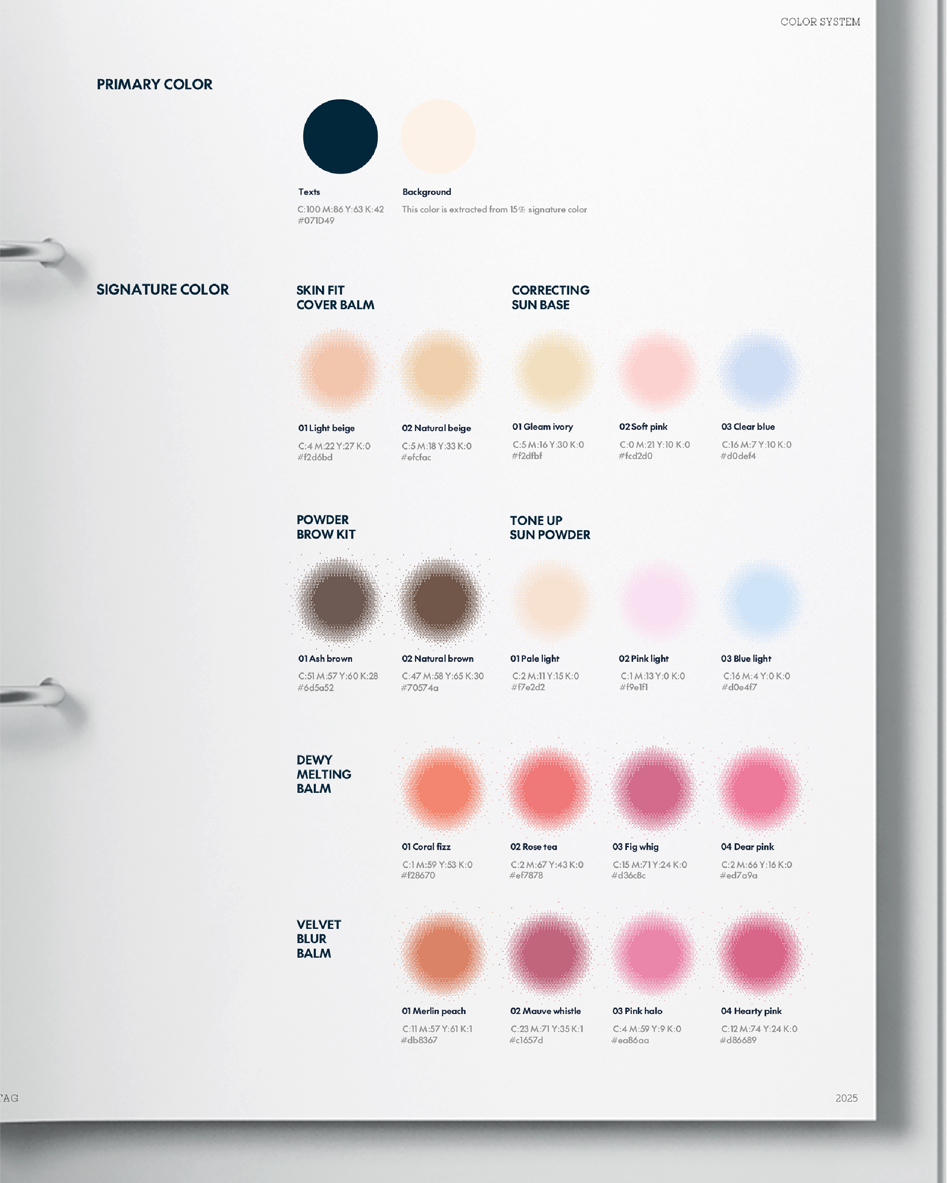
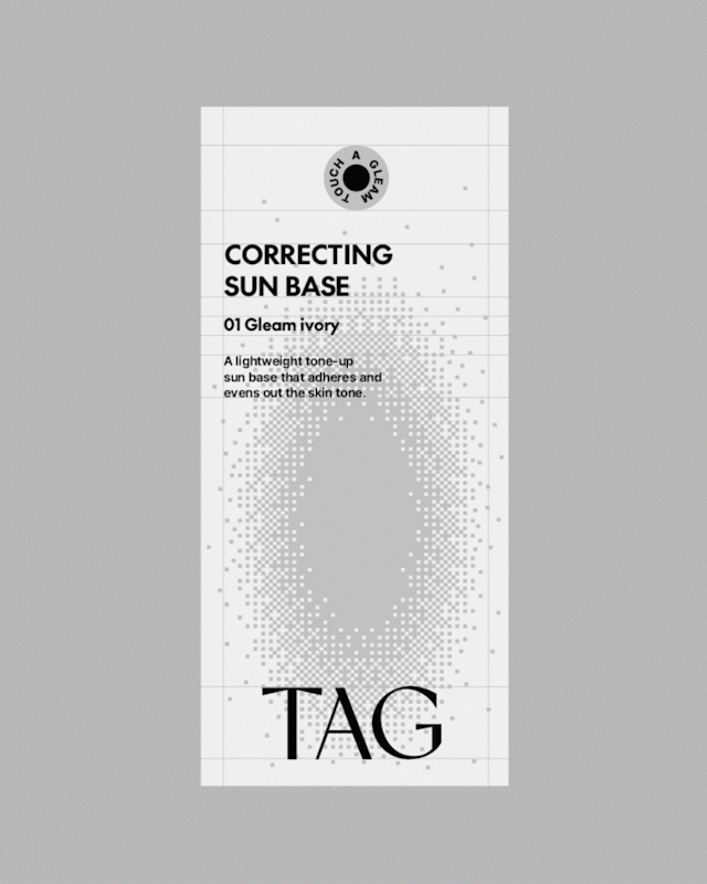
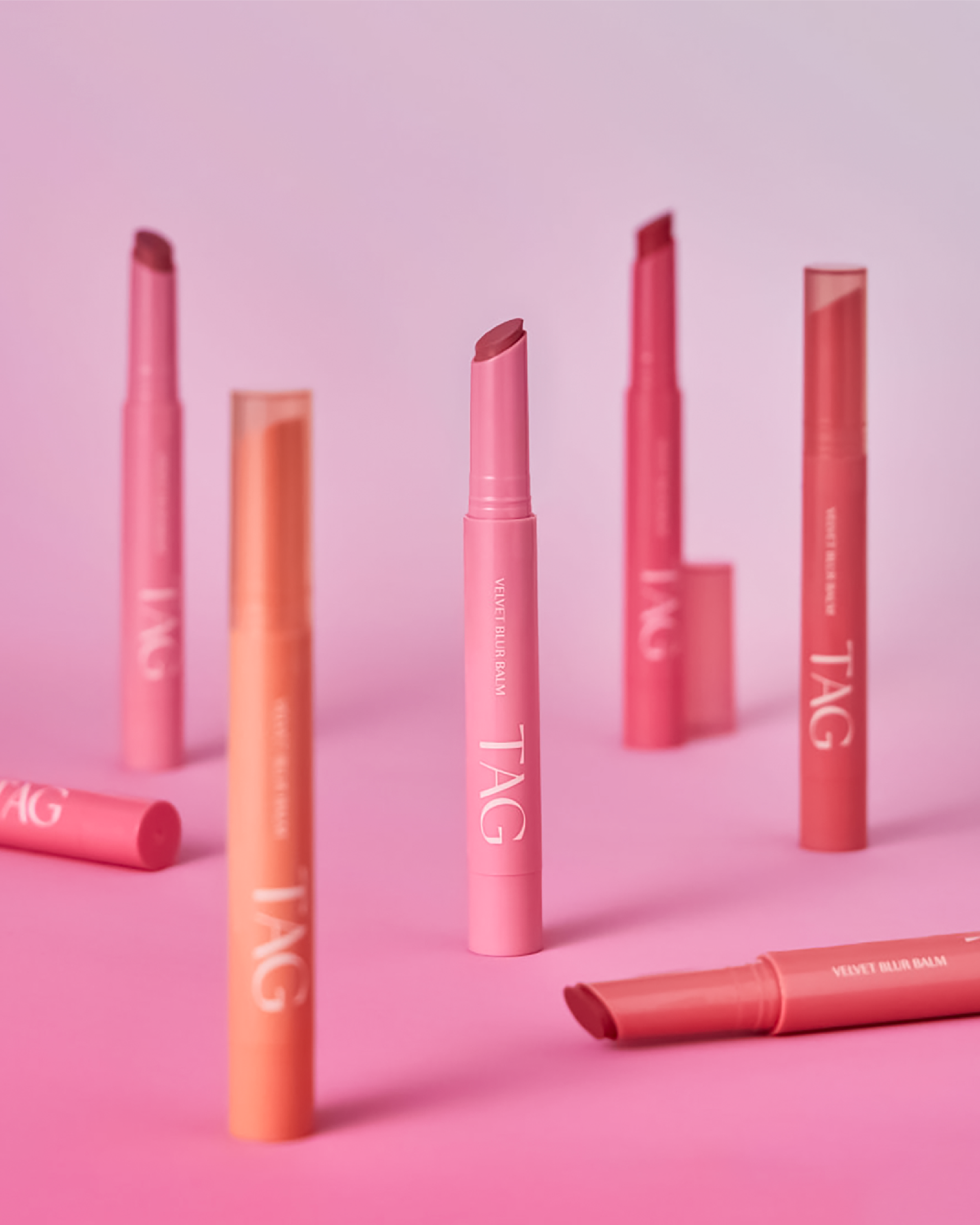
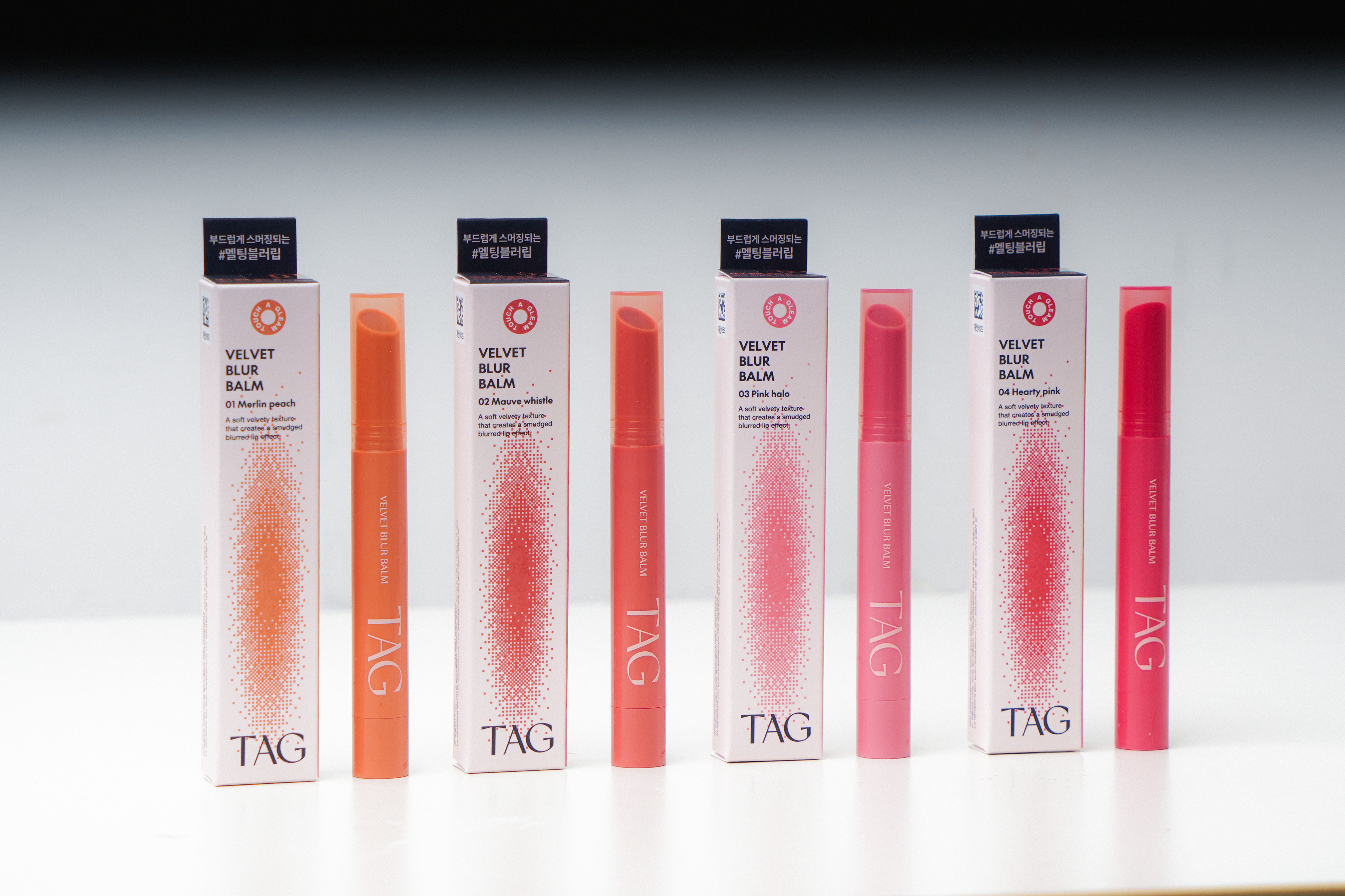
To address these challenges, we developed a new signature motif that embodies TAG’s core concepts of light and color.
• A visual language that captures both the diffusion of light and the movement of pigment particles
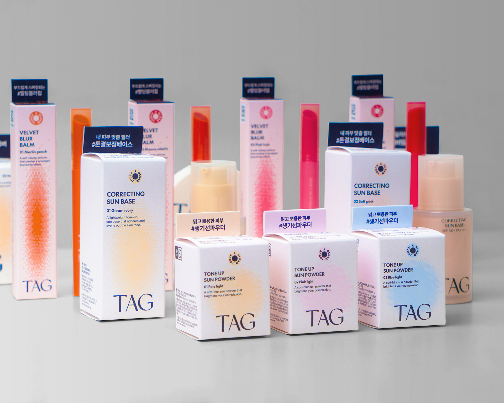
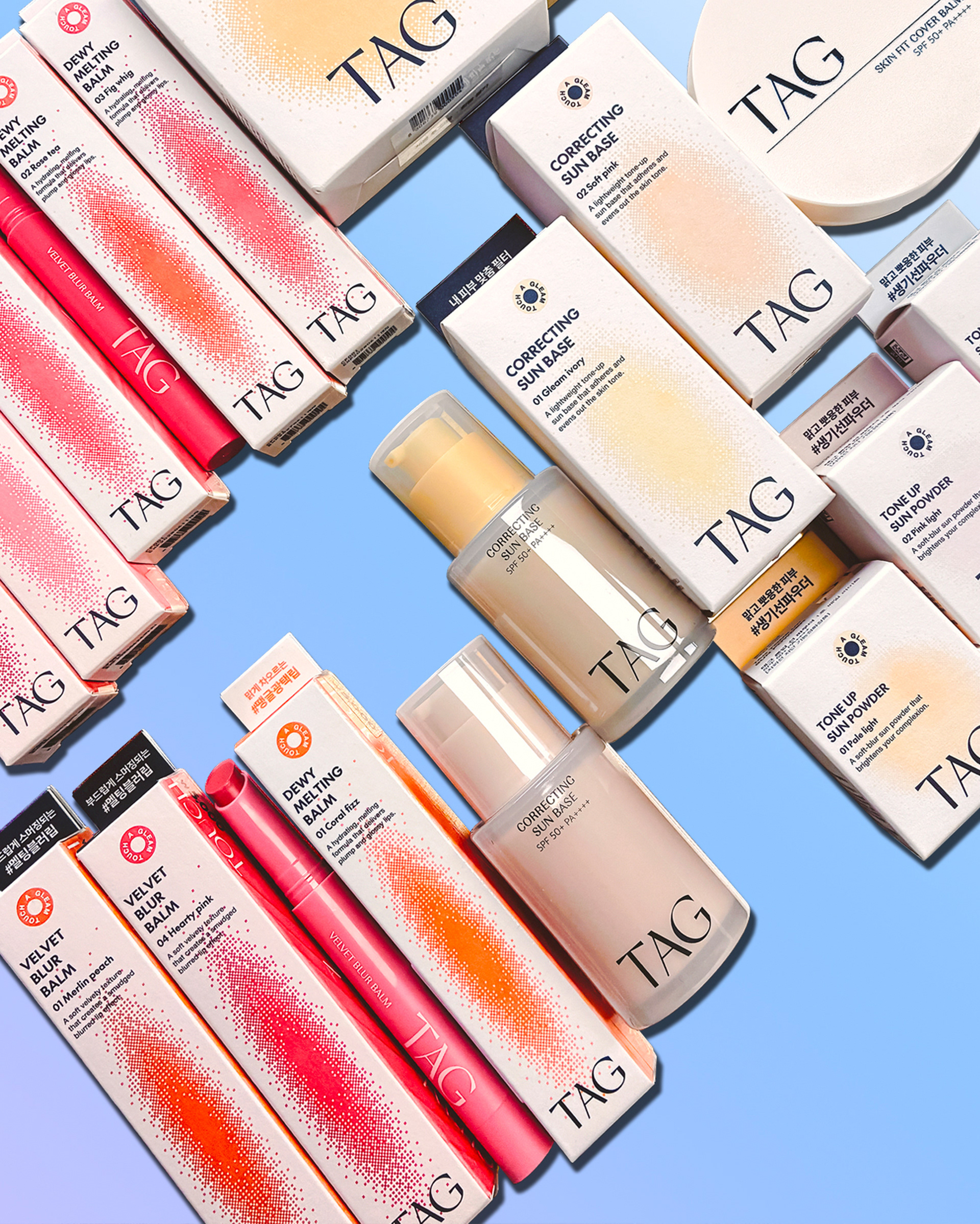
• A flexible system adaptable to various product sizes and proportions
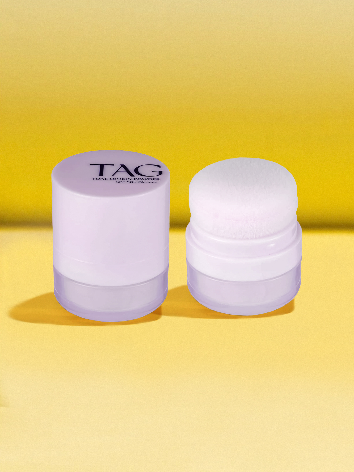
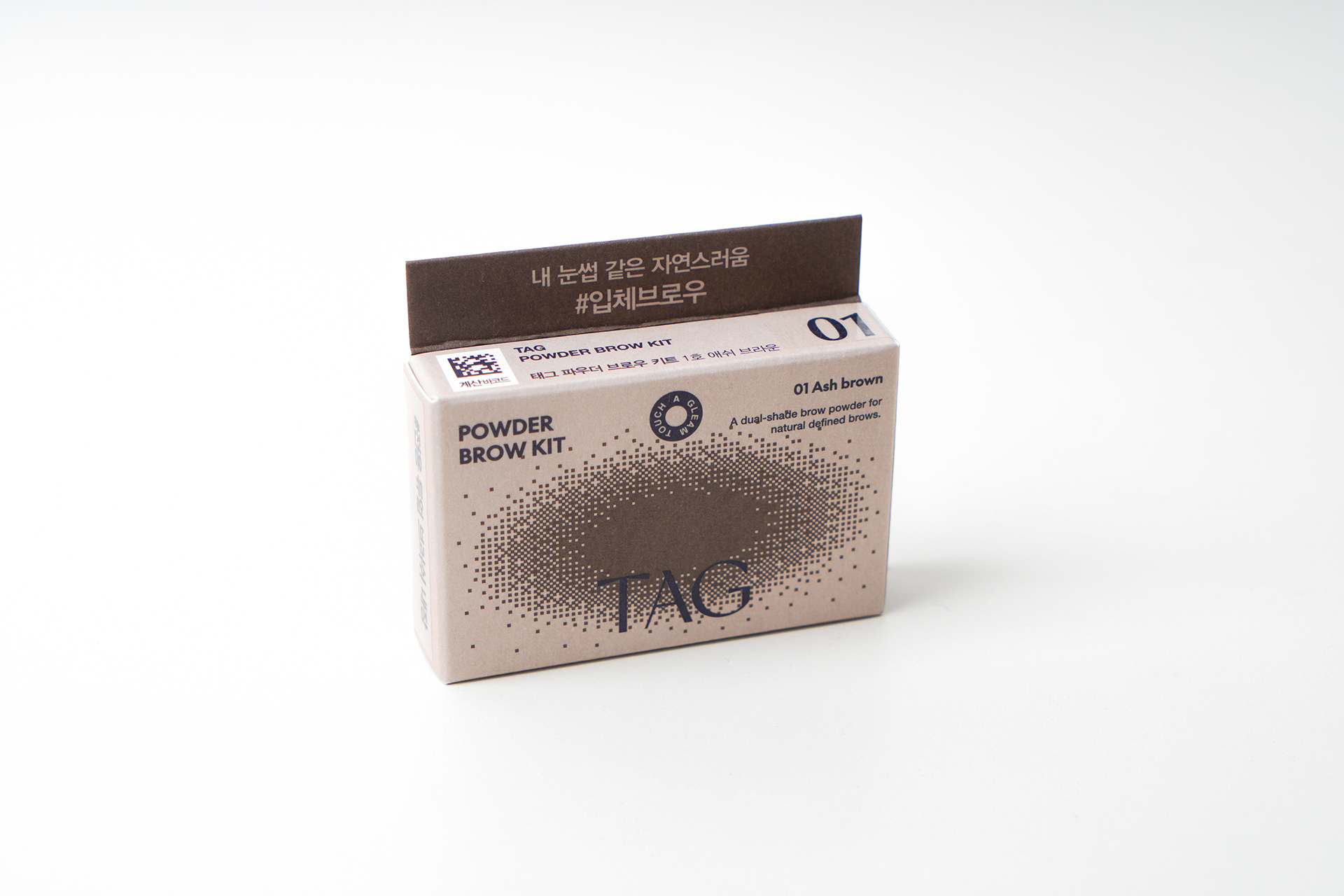
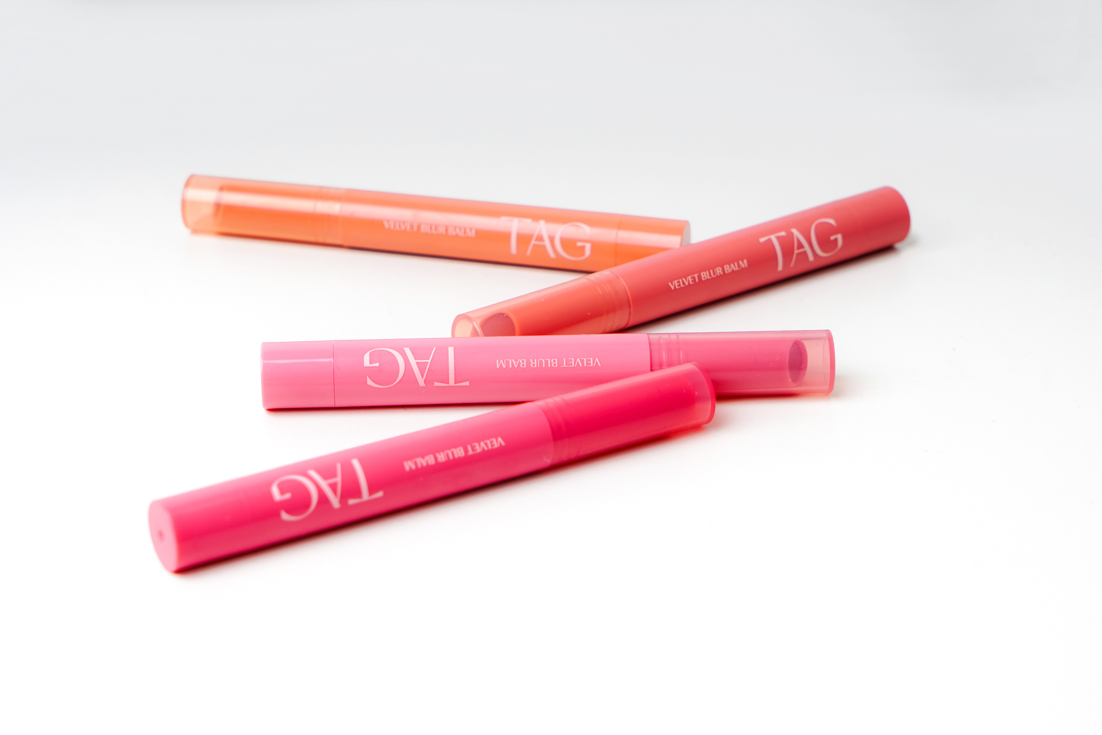
• Application of product shades directly into the motif, with reduced transparency to function as background graphics
This approach created a cohesive and easily expandable design system, allowing TAG to visually communicate its brand essence while remaining efficient and cost-effective.
Brand Background
Co-developed by Too Cool for School (@toocoolforschool_official) and Daiso (@daisolife), TAG embraces the tagline “Touch A Gleam”. The brand expresses the harmony of dual beauty through base makeup looks inspired by the interplay of light and shadow.
Project Challenge
As a brand positioned within Daiso’s affordable pricing structure, TAG faced several issues:
• The need for cost-effective design solutions
• Inefficiencies and inconsistencies in its existing graphic and packaging design
• A lack of coherent visual identity and scalability
Our role was to redefine the brand identity and build a packaging design system that is both visually consistent and expandable across product families.
Design Approach
To address these challenges, we developed a new signature motif that embodies TAG’s core concepts of light and color.
• A visual language that captures both the diffusion of light and the movement of pigment particles
• A flexible system adaptable to various product sizes and proportions
• Application of product shades directly into the motif, with reduced transparency to function as background graphics
This approach created a cohesive and easily expandable design system, allowing TAG to visually communicate its brand essence while remaining efficient and cost-effective.